Trading Dashboard Redesign
The Trading Dashboard is an internal tool that lets users quickly review and generate trade tickets for a large number of accounts. Everyday an algorithm analyzes all accounts, determines which accounts need to be traded, and then places those account into a list. The Trading Dashboard presents the list and gives the users’ a chance to review before generating a trade ticket for the entire batch of accounts.
Objective
The objective was to redesign a solution that would accommodate the next 100,000 accounts. The existing dashboard had numerous usability issues and lacked key functionalities which forced users to create their own workarounds.
Role
User Experience and Design
Approach
The dashboard itself was a collection of tools that catered to 2 different of groups users; the trading team and the operations team. The project goal was to focus on adding and improving key functionalities for the trading team. Prior to any design work, I began observing the trading team’s day to day usage in order to get first hand experience for how they interacted with the tool. I was able to identify multiple pain points and learn creative ways the traders had developed in order to circumvent the dashboard’s limitations. Throughout the design process we held weekly meetings where I would iterate and present mocks to the users. During these meetings all members involved in the project were present so we could discuss any issues as they became apparent.
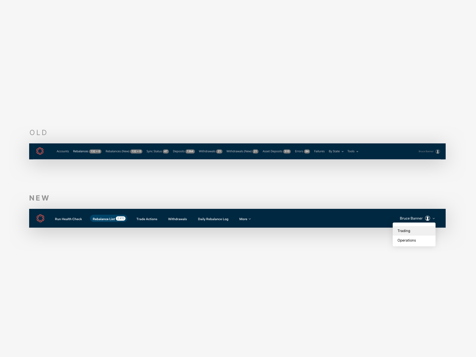
Role Based Headers
The first problem I identified was the Header. Developers had continually amended important tools onto the header with the hopes of easier access to both user groups. The result was a messy header populated with only a few relevant tools depending on your role. In order to clear up the clutter, I introduced a role based Header dropdown. Giving the user the ability to switch what type of tools they needed not only cleaned up the header, but made for a more intuitive interface for future users.
#Filters
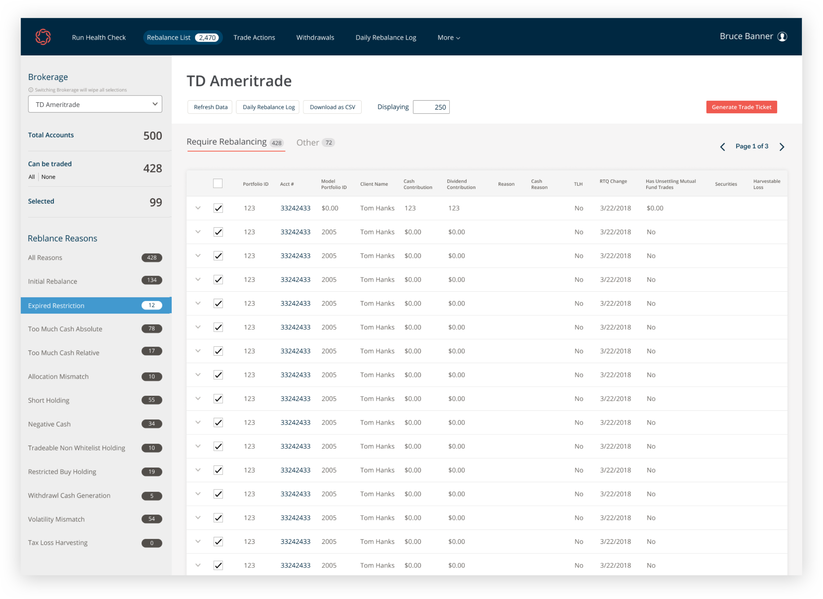
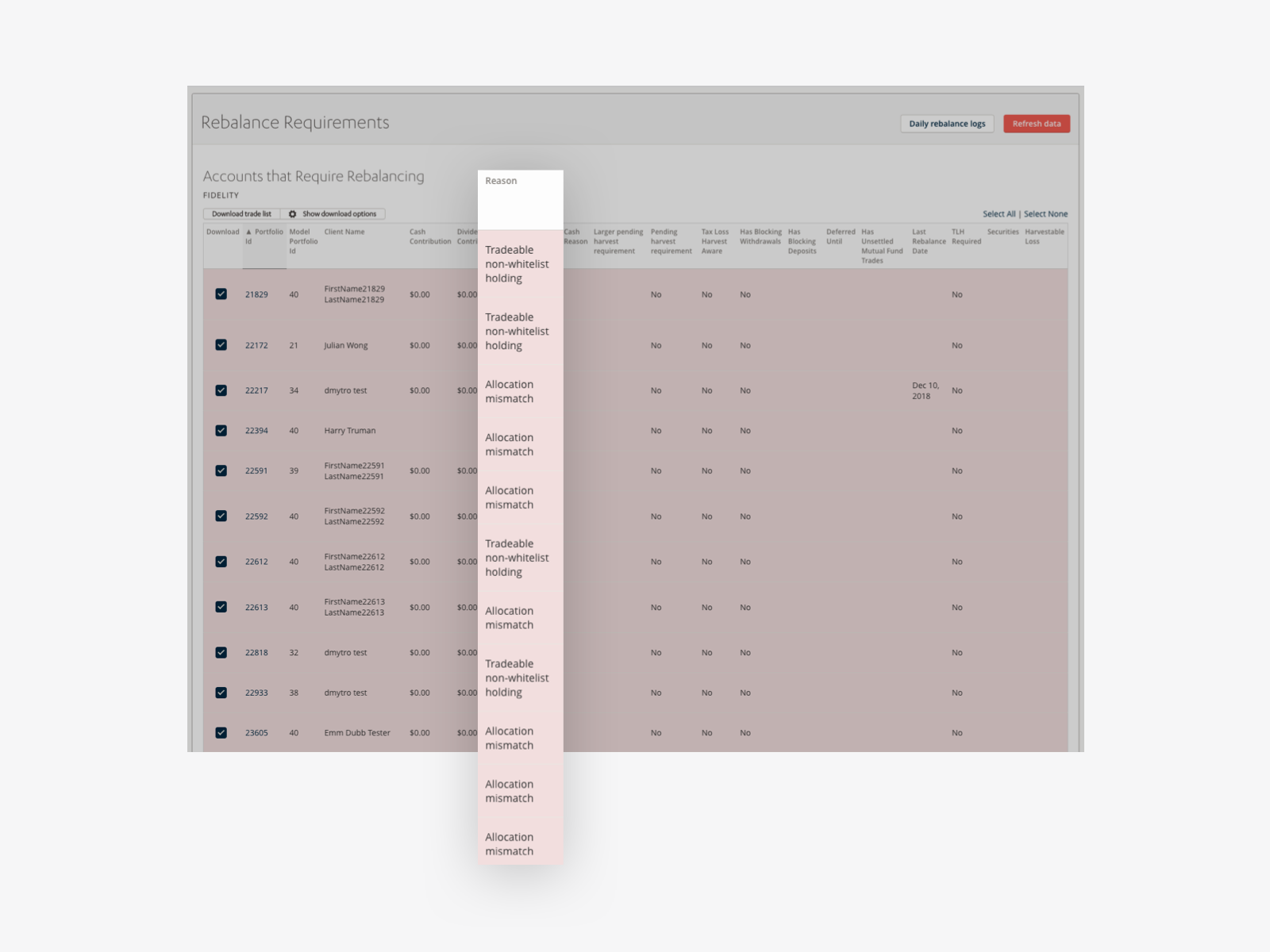
The most important piece of information for the dashboard is the Rebalance Reason, it is the reason why the algorithm determines the specific account needs to be looked at. In the old design the reason was displayed in one of the many columns for each account. This design worked while the number of account was low, but as the volume increased the page performance began to suffer. Trying to retrieve too many accounts caused the page to crash and eventually pagination was introduced in order to make offset the volume. While this solved the loading issue, the dashboard was fragmented into smaller sets making it hard to find and sort through account lists.
Sidebar Solution
The solution I came up with was a sidebar that became home to a number of filters. At the highest level there is brokerages. Since each brokerage requires their own format for trades it made sense to complete one brokerage at a time. Next came counts for total number of accounts, accounts that could be traded, and accounts that could not be traded. This gave users an idea of how many account they actually had to take action on. Finally each rebalance reason with the number of accounts within each.
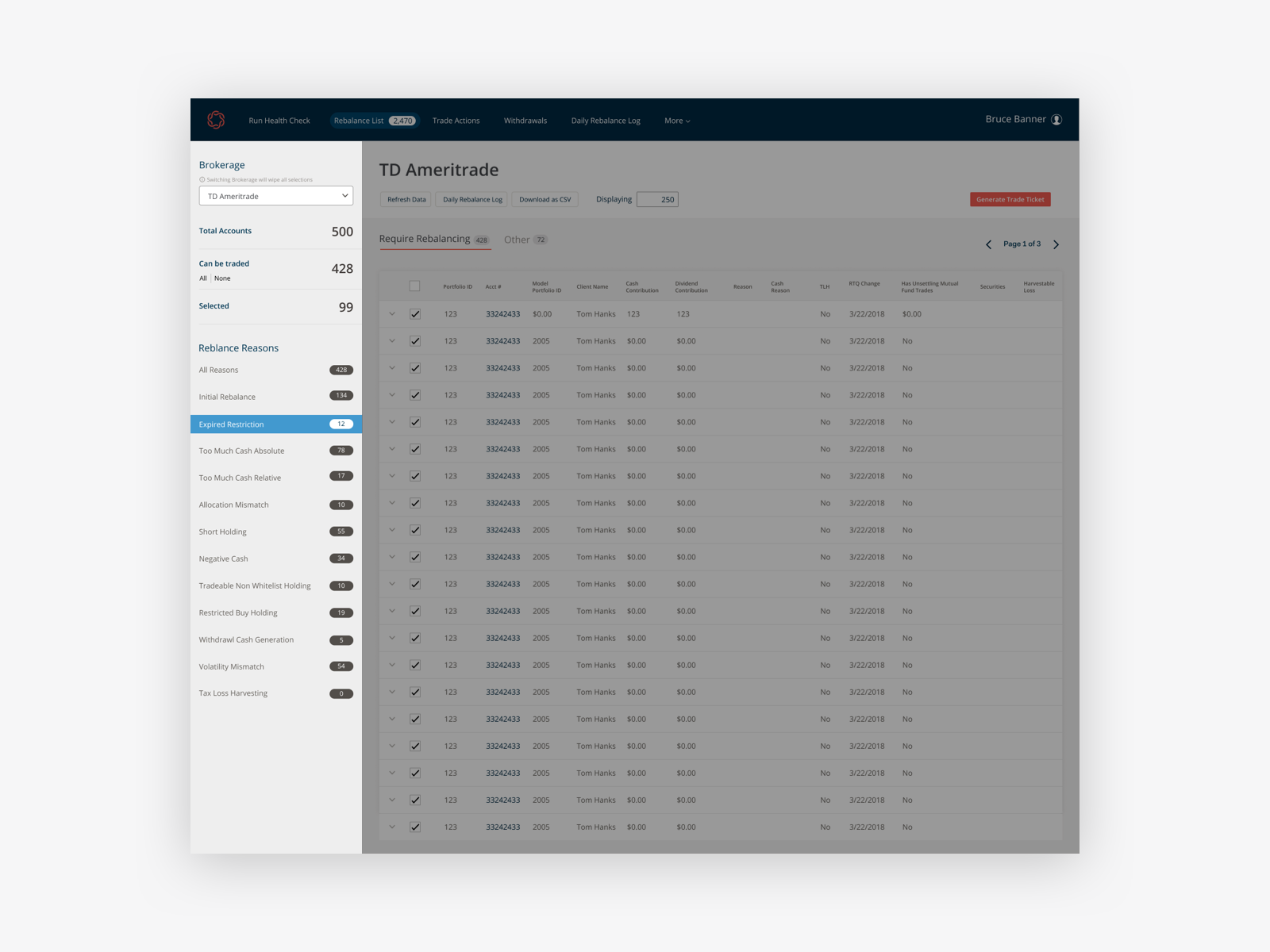
Account List
The new account list showed only the most important pieces of information for each account. I also added an expanded view which showed more information toggled by the dropdown icon. The supplemental information meant the users no longer had to open a new page to see account information needed for troubleshooting errors.
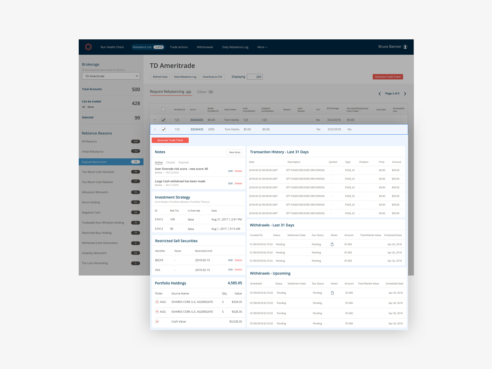
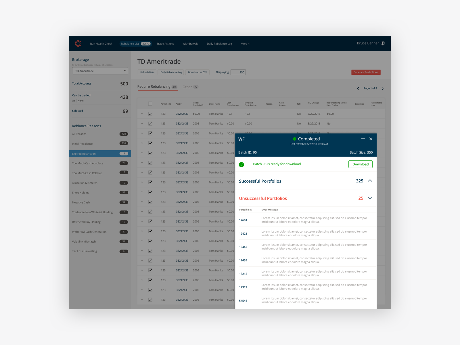
Error Modal
Once all the inspecting has been completed and the accounts are ready to go, the final step is to generate a trade ticket. While in theory at this stage everything is done, once in a while some errors will appear holding up the entire batch. I introduced a modal to show the errors on the same page allowing the user to 1. Quickly see the errors within each batch 2. Either fix or remove the account causing the issue and finish generating the ticket for the entire batch. This removed the bottleneck a single error could create and allowed the rest of the batch to finish.