SigFig Mobile Redesign
SigFig is a financial app that offers personalized managed investment accounts. Charging a significantly lower fee than traditional institutions, Sigfig is an attractive solution for people of all investing backgrounds. Prior to offering managed accounts, SigFig's core product was a dashboard that aggregated financial data.
Objective
The objective for the project was to build the mobile experience around SigFig’s Managed Account. The previous design was focused on delivering various data points in order to give users a detailed view of their portfolio’s performance. The new version would shift focus to SigFig’s Managed accounts.
New Focus, New Navigation
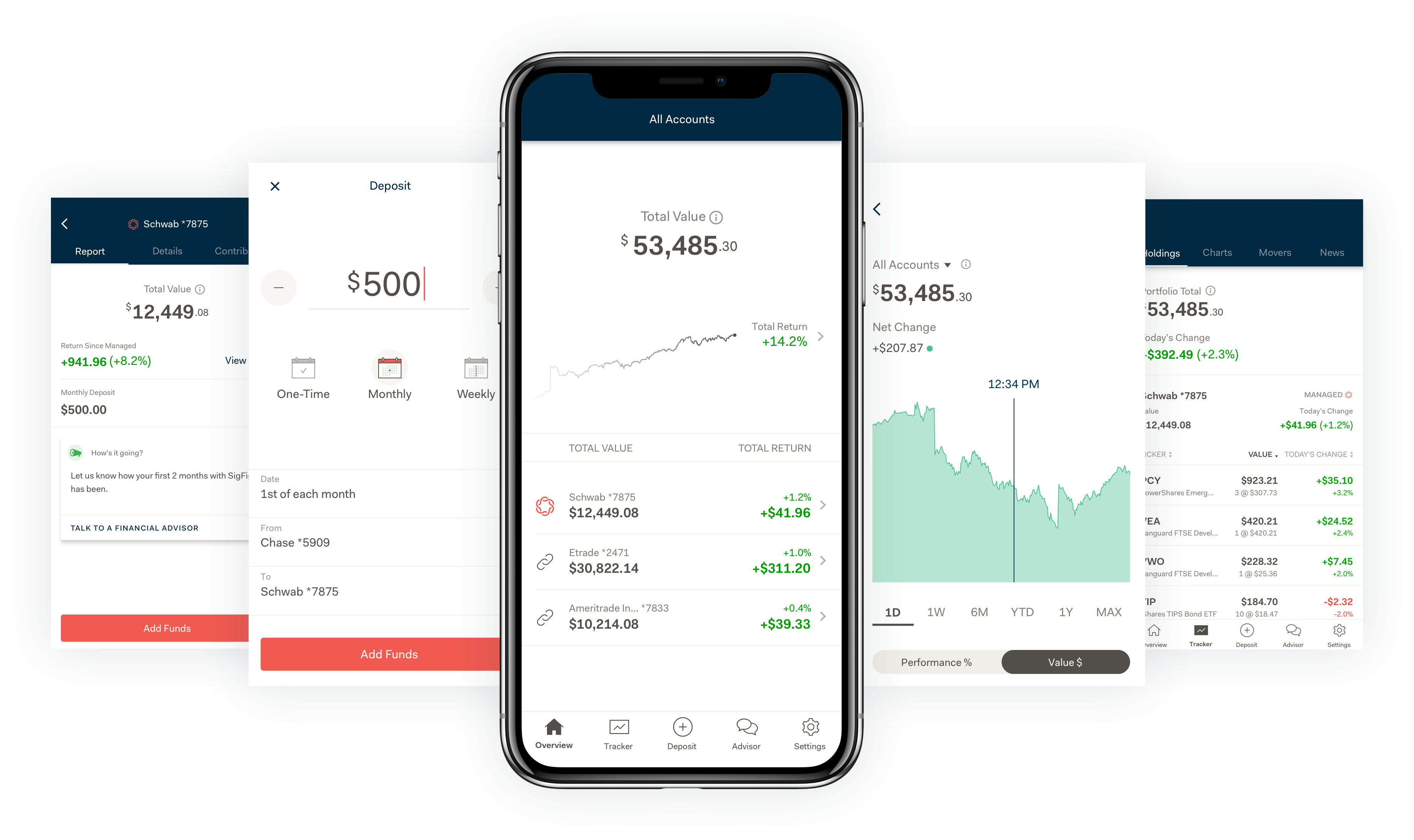
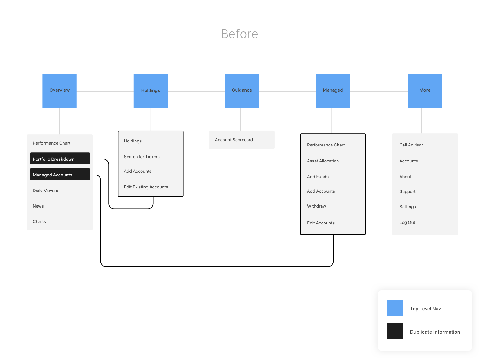
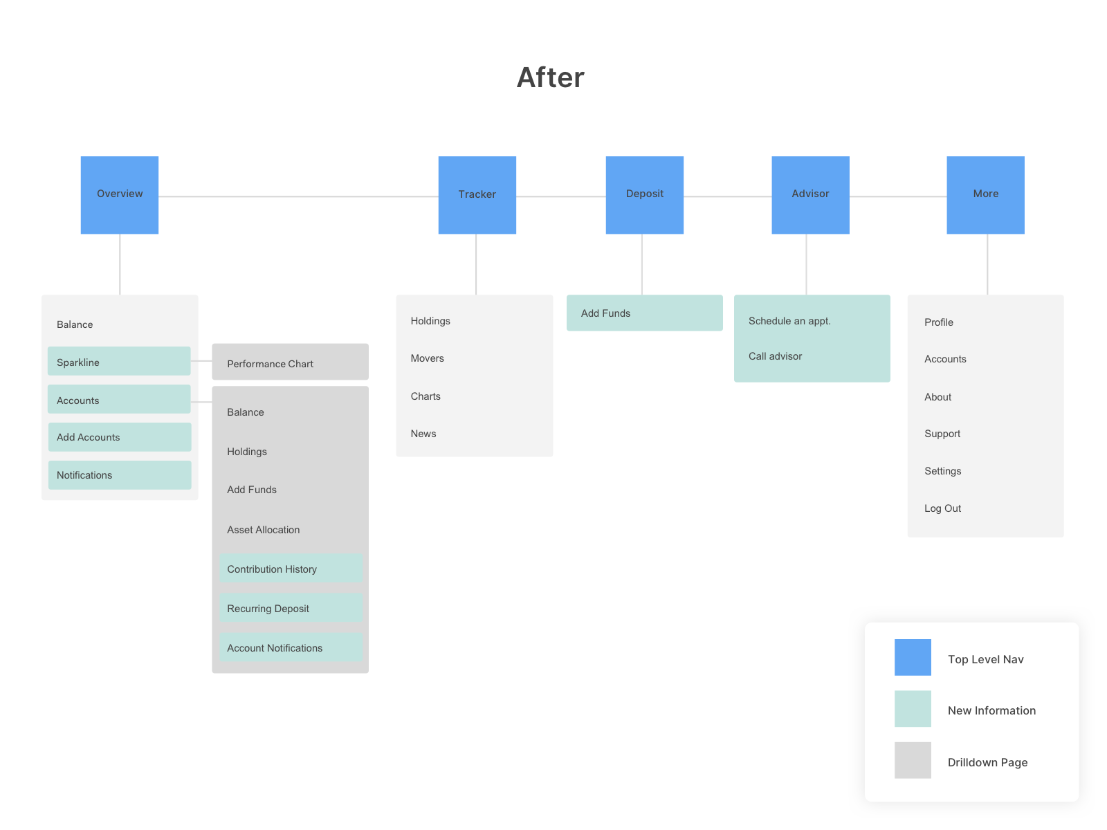
By mapping out the entire content inventory of the app I was able to identify some key problems with the existing information architecture. With the project goals in mind I decided the first step was to redefine the architecture and start fresh. The result was 5 main categories represented in the navigation: Overview, Tracker, Deposit, Advisor, and Settings.
Simplifying the Overview
The Overview is split into 3 main sections. The aggregate total balance for all accounts is the main focus at the top. Next is the sparkline which summarizes performance within the past year. Finally the account list displays all accounts being tracked along with its performance and total. Users can also drilldown into each account and find account details such as transfer history, asset allocation, and an overall summary.
Performance Chart
Convincing a team of finance experts to remove the performance chart from the home page of the app was no easy task. In an effort to keep the Overview simple and clean, I attempted a number of iterations on the performance chart, but ultimately decided to isolate the performance chart on it’s own page. I was able to keep the Overview clean and provide a much better experience with the performance chart.
Deposit
The second goal of the project was to increase AUM, or get people to invest more money. In an attempt to uncover user experience issues, I had performed a series of simple user tests within the company. I had people perform a list of basic tasks within the app and observed how they interacted. To my surprise, when asked to add funds into their account, a majority of people had issues navigating directly to the deposit page. Luckily the goal aligned with directly with the solution. I gave the deposit page a new home front and center in the navigation bar.
Tracker
After consulting with data team, I found that a majority of our existing users were not using the app for the Managed Account product. These users we dubbed ‘Portfolio Trackers’ were using the app as an aggregator for all of their accounts. Their job was different that the managed account users. This groups’ main job was to see all the details for each of their accounts. I decided to compartmentalize the tracking functionalities and the managed account in order to achieve 2 things: 1. Give us the flexibility to remove this section all together in the future or for potential partners. 2. Give us the ability to elevate the Managed Accounts on the Overview
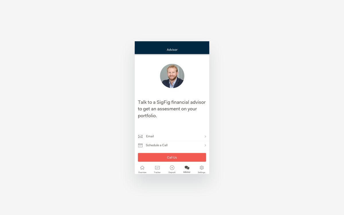
Advisor
The Advisor page was a new addition to the app navigation. The decision to add this came from a small test where we made outbound calls to a small sample of 140 existing customers. We learned that although this did not move the needle with the increasing Assets Under Mgmt goal, the building of a relationship was vital. By building a relationship with our users not only did we build trust, we were able to learn about issues they had, that our product could not resolve. The information gathered would help us significantly in building new features and helping solve our user’s needs.